Green


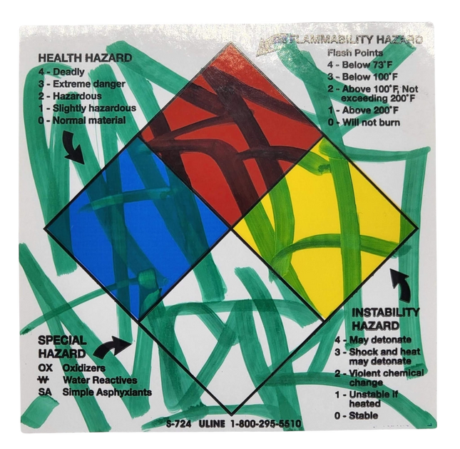
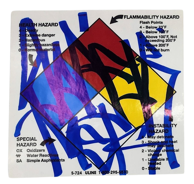
Saber Health Hazards Slap-Up Label Sticker Original Tag Art by Saber
Health Hazards Slap-Up Label Sticker Original Tag Art by Saber Original Permanent Marker Art Drawing on Mailing Glossy Warning Sticker by Graffiti Artist Modern Street Artwork. 2020 Signed Original Slap Up Graffiti Art Tag 4x4 Marker Tagged on Health Flammability Special Instability Hazard Warning Label Uline S-724 Sticker. Slap Up In Perfect Condition. Artistic Alchemy on Hazardous Grounds The transformation of ordinary objects into visual spectacles is a hallmark of Street Pop Art and Graffiti Artwork. In this vein, the "Health Hazards Slap-Up Label Sticker" by Saber, real name Ryan Weston Shook, from the United States, stands out as a captivating fusion of warning label iconography and graffiti artistry. Created in 2020, these pieces symbolize how graffiti artists repurpose everyday items, such as health flammability and particular instability hazard warning label stickers, to make bold statements through art. Saber's original permanent marker art drawings on these glossy arrow stickers testify to the genre's ingenuity and ability to imbue commonplace materials with new life and meaning. Symbolism and Significance in Saber's Work Saber's art on hazard warning stickers is particularly poignant. The stickers' inherent message of caution and danger is juxtaposed with Saber's tags' freeform and expressive nature. This contrast is not merely aesthetic but symbolic, alluding perhaps to the inherent risks and hazards of graffiti creation. In the urban jungle, the graffiti artist is both a creator and a transgressor, and Saber's work captures this duality perfectly. The use of bright, contrasting colors over the hazard symbols does not obscure the warning but instead invites the viewer to reflect on the layers of meaning within the piece. Reflections of 2020 in Street Pop Art 2020 was not just another year in the annals of history but a turning point for societies worldwide. The original slap-up graffiti art tags on these health and hazard stickers by Saber reflect a year marked by global upheaval and a reevaluation of what is considered safe and dangerous. In his 4x4 marker-tagged creations, Saber captures the spirit of an era where the world grappled with health crises and societal instability. By signing each piece, Saber not only claims authorship but also anchors the artwork in time and place, offering a permanent marker — literally and figuratively — of a moment in time through the lens of Street Pop Art and Graffiti Artwork.
$15.00

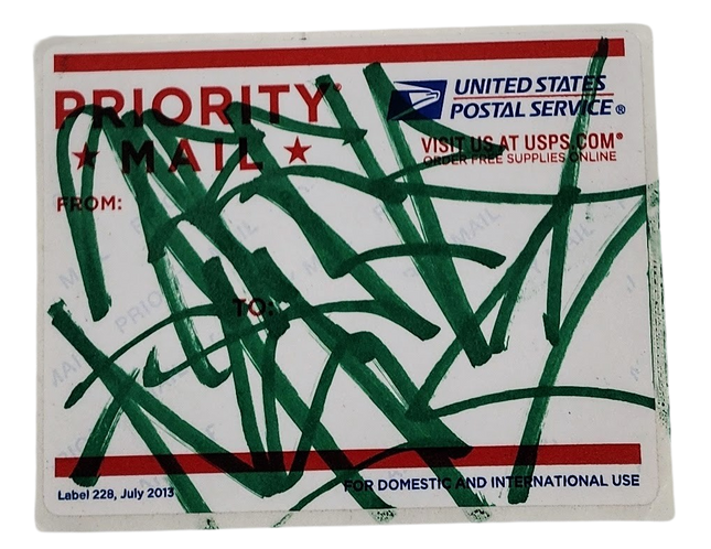
Saber Priority Mail 228-2013 Slap-Up Label Sticker Original Tag Art by Saber
Priority Mail 228-2013 Slap-Up Label Sticker Original Tag Art by Saber Original Permanent Drawing Art on USPS Mailing Label by Graffiti Artist Modern Street Artwork. 2020 Signed by Tag Original Slap Up Graffiti Art Tag 4.5x3.5 Color Marker on the USPS United States Postal Service Priority Mail Label 228-2013. Street Art's Intersection with Everyday Objects The 'Priority Mail 228-2013' slap-up label sticker featuring original tag art by Saber is a remarkable embodiment of how modern street artwork intersects with everyday objects. Saber, a recognized name in graffiti, transforms a mundane USPS mailing label into a canvas for his artistic expression. This piece, a 4.5x3.5 color marker on the USPS United States Postal Service Priority Mail Label 228-2013, is 2020 original, showcasing the artist's unique ability to repurpose everyday items into art. Saber's Artistic Commentary on Communication This work is more than an act of creative repurposing; it serves as a commentary on communication and how messages are transmitted in the modern world. By choosing a Priority Mail label, Saber taps into the theme of urgency and the importance of messages that such labels signify. His artwork disrupts this narrative of swift communication with a personal and cryptic tag, suggesting that amidst the rapid exchange of information, there are layers of meaning waiting to be uncovered. The tag, applied with a color marker, flows across the label in a style reminiscent of Saber's street art murals. The vibrant green strokes against the white and red of the Priority Mail label create a stark contrast, symbolizing perhaps the clash between the institutional and the individual, the standardized and the personalized. The use of a USPS label also points to the public domain as a space ripe for artistic intervention, where the artist can leave a mark that is both provocative and publicly accessible. Modern Street Art and the Culture of Slap-Up Tags Saber's choice of a slap-up label adheres to the culture of street pop art, where quick, spontaneous creations are integral to the art form. Slap-up tags are known for their immediacy and are often used by artists to leave a quick signature in public spaces. This piece emulates that culture, with Saber's tag being a literal and figurative mark of the artist's presence. In the context of street pop art and graffiti artwork, Saber's 'Priority Mail 228-2013' label is a testament to the genre's evolving canvas. It moves beyond walls and subway cars to find a place on portable, everyday items, thus expanding the reach of street art. Saber, an American artist, is known for such innovations, constantly challenging the boundaries of where and what street art can be. In sum, the artwork on the Priority Mail label is a statement on the power of street art to transform the mundane into the extraordinary. It captures the essence of street pop art's spontaneity and Saber's role as a pioneer in the movement. The tag, a signature of the artist's identity, reminds of the personal touch in an increasingly impersonal world dominated by digital communication and standardized services.
$24.00

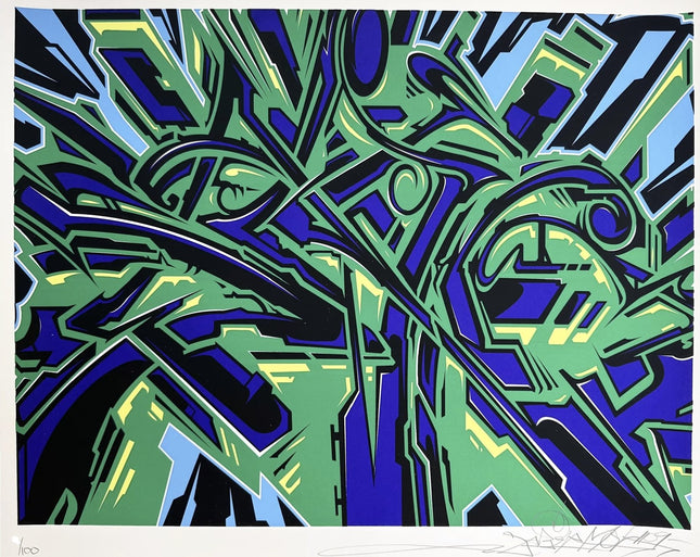
Saber SABER ONE Silkscreen Print by Saber
SABER ONE Hand-Pulled 5-Color Silkscreen Print on Cotton Fine Art Paper by Desirable Artist Saber Limited Edition Pop Art Artwork. 2009 Signed & Numbered Limited Edition of 100 Artwork Size 20x16 SABER ONE, 2009 5-Color Screen Print on 100% cotton archival paper 20 x 16 in (50.8 x 40.64 cm) Limited Edition of 100 Signed and Numbered by the Artist
$620.00$527.00