Text Type Words & Sayings

200 artworks

  • And Then Things Got Better- Spring Archival Pigment Print

    Denial- Daniel Bombardier And Then Things Got Better- Spring Archival Pigment Print

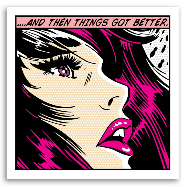
    And Then Things Got Better- Spring Limited Edition Archival Pigment Prints on 330gsm Fine Art Paper by Denial Graffiti Street Artist Modern Pop Art. 2021 Signed & Numbered Limited Edition of 25 Artwork Size 24x24 Spring Variant And Then Things Got Better – Spring Edition by Denial in Street Pop Art & Graffiti Artwork And Then Things Got Better – Spring is a 2021 limited edition archival pigment print by Canadian street pop artist Denial, also known as Daniel Bombardier. Printed on 330gsm museum-grade fine art paper and measuring 24 x 24 inches, this piece is part of a signed and numbered edition of just 25. As one of the expressive variants in the And Then Things Got Better series, the Spring edition brings a refreshing energy and emotional shift to a classic comic-inspired format. Denial captures the psychological moment of transition with a female figure drawn in high-contrast linework, framed tightly in a close-up of her face. Her vivid teal hair, eyes, and lips contrast with the cream-toned halftone skin, emphasizing clarity and renewal in contrast to the turmoil depicted in earlier colorways of the same composition. The Role of Color and Message in the Spring Variant The Spring edition revitalizes Denial’s familiar scene of reflection and emotional complexity through its fresh, cool palette. The use of teal throughout the character’s features creates an uplifting atmosphere, mirroring seasonal rebirth and a sense of emotional reset. The caption And Then Things Got Better, rendered in black against a teal panel, shifts in meaning depending on the viewer’s frame of mind. Within this color scheme, the phrase feels less ironic and more quietly triumphant. The character’s upward gaze and slightly parted lips hint at realization and hope rather than crisis or aftermath. Her facial expression remains poised in emotional suspense, a trademark of Denial’s approach to visual narrative. This piece explores the delicate balance between fragility and strength, offering a fresh layer of emotional depth through a minimal yet powerful adjustment in tone. Denial’s Commentary Through Comic Language in Street Pop Art & Graffiti Artwork Denial is one of the most prominent figures in contemporary Street Pop Art & Graffiti Artwork, known for repurposing the visual vocabulary of pop culture, propaganda, and consumer signage into emotionally charged works. The And Then Things Got Better series demonstrates his ability to manipulate familiar imagery in new ways, using subtle variation to explore themes of mental health, societal conditioning, and personal evolution. The Spring edition maintains the precision of Denial’s comic-inspired format—Ben-Day dot textures, thick outlines, and exaggerated features—while allowing the color choices to speak directly to the emotional undercurrent. As with all works in this series, the format recalls mid-century mass media but carries the urgency and intimacy of street culture. The juxtaposition of mass reproducibility with the authenticity of emotion creates a tension that is central to Denial’s impact in the genre. Production Quality and Collector Significance of the Spring Edition This edition is printed using archival pigment inks designed for longevity, preserving the richness of color and detail over time. The 330gsm fine art paper offers both durability and a tactile surface that complements the graphic strength of the image. Each piece is hand-signed and numbered by Denial, affirming its place within a tightly curated edition. The Spring variant’s soft yet bold aesthetic, paired with its scarcity, makes it a highly collectible artifact in the modern pop and street art market. More than just a reimagining of an existing motif, it is a distinct chapter in a visual dialogue about resilience and change. Denial’s Spring edition is a vivid embodiment of Street Pop Art & Graffiti Artwork’s capacity to hold both critical reflection and emotional release in a single, stylized frame.

    $385.00

  • Drippy Throw Ups Original Marker Painting by MartÍ Sawe

    MartÍ Sawe Drippy Throw Ups Original Marker Painting by MartÍ Sawe

    Drippy Throw Ups Original Marker Painting by MartÍ Sawe One of a Kind Artwork on Mixed Media by Street Art Pop Artist. 2025 Signed Marker Mixed Media Painting Original Artwork Size 8.5x4.4 on Fine Art Paper Martí Sawe Drippy Throw Ups Original Marker Painting Drippy Throw Ups is a 2025 one of a kind original marker painting by Martí Sawe, created on mixed media support and measuring approximately 8.5 x 4.4 inches. Executed with bold red and green lettering surrounded by yellow bubble accents and directional arrows, the piece reflects the energy of classic graffiti throw-up styles translated into a compact studio format. As Street Pop Art & Graffiti Artwork, it captures the immediacy of handstyle lettering while retaining the spontaneity and personality that define authentic marker-driven compositions. Throw-Up Tradition and Expressive Letterform The throw-up is a foundational graffiti format, designed for speed, clarity, and impact. In Drippy Throw Ups, Martí Sawe channels this tradition through rounded, interlocking letters outlined in deep green with vibrant red fills. The addition of drips, arrows, and cloud-like bursts reinforces the raw visual language associated with street tagging and quick wall executions. Despite its small scale, the composition maintains strong movement, with arrows pointing downward and outward to guide the viewer’s eye across the surface. The handwritten signature and energetic linework emphasize the work’s direct, unfiltered character. Within Street Pop Art & Graffiti Artwork, such throw-up studies serve as both homage to graffiti history and assertion of individual style. Originality, Scale, and Material Presence As a signed original marker painting rather than a print edition, Drippy Throw Ups carries the physical immediacy of the artist’s hand. Marker strokes remain visible, with slight variations in opacity and line thickness adding texture and authenticity. The mixed media surface enhances the vibrancy of the saturated red, green, and yellow palette, allowing the colors to stand out against the neutral background. Compact in size yet visually assertive, the piece demonstrates how Street Pop Art & Graffiti Artwork can distill large wall aesthetics into intimate collectible formats without sacrificing attitude or graphic power.

    $400.00

  • Iconic Bubble Black Silkscreen Print by Cope2- Fernando Carlo

    Cope2- Fernando Carlo Iconic Bubble Black Silkscreen Print by Cope2- Fernando Carlo

    Iconic Bubble- Black 8-Color Hand-Pulled Limited Edition Silkscreen Print on 300gsm Somerset Satin Paper by Cope2 Rare Street Art Famous Pop Artwork Artist. Edition of 75 signed by the artist 8 color screenprint on 300 gsm somerset paper Dimensions: 75 x 55cm year 2019

    $352.00

  • Piano Concerto 1 Silkscreen Print by Crash- John Matos

    Crash- John Matos Piano Concerto 1 Silkscreen Print by Crash- John Matos

    Piano Concerto 1 Limited Edition Graffiti Artwork Off-Set Screen Print on Thin Glossy Art Paper by Street Artist Crash- John Matos. 2021 Signed & Numbered Limited Edition of 35 Artwork Size 16x20 The artwork titled "Piano Concerto 1" is a limited edition piece by the renowned street artist Crash, whose real name is John Matos. It's a dynamic example of how graffiti transcends the street context, entering the realm of fine art with boldness and authenticity. Created in 2021, this piece is part of an exclusive series, with only 35 signed and numbered editions, making each print a coveted item for collectors. The artwork size is 16x20 inches, a substantial format that allows the intricate details and vibrant colors to stand out, encapsulating the viewer in its visual rhythm. Crafted with off-set screen printing on thin glossy art paper, the piece reflects Crash's roots in the subway graffiti movement of New York City in the early 1970s. His work is characterized by a mastery of color and shape, bringing together the raw energy of the streets with the precision and skill of a classically trained artist. In "Piano Concerto 1," the influence of pop art is evident, with the inclusion of comic-strip motifs and bright, contrasting colors that pop against the glossy finish of the paper. Each print from the series showcases the unique blend of abstract and figurative elements that Crash is known for. What's particularly striking about this piece is the sense of movement conveyed through the composition — a symphonic burst akin to the musical crescendo of a piano concerto, hence the title. There's a playful yet deliberate layering of elements, from the cartoon-like hands to the splatters and drips, which creates an almost three-dimensional effect. This work is not just a static image; it captures the liveliness and improvisation central to street art and musical performances. "Piano Concerto 1" stands as a representation of how graffiti art continues to influence and be a significant part of the contemporary art scene. It demonstrates how artists like Crash can navigate street and studio spaces, creating works that resonate with a broad audience and contribute to the ever-evolving narrative of urban art culture.

    $285.00

  • War & Peace Silkscreen Print by SSUR- Ruslan Karablin

    SSUR- Ruslan Karablin War & Peace Silkscreen Print by SSUR- Ruslan Karablin

    War & Peace 3-Color Hand-Pulled Limited Edition Silkscreen Print on Fine Art Paper by SSUR- Ruslan Karablin Rare Street Art Famous Pop Artwork Artist. Silkscreened print limited to 50 pieces. Signed and numbered with embossed logo on the bottom corner.

    $323.00

  • Van Ness Silkscreen Print by Dave Kinsey

    Dave Kinsey Van Ness Silkscreen Print by Dave Kinsey

    Van Ness Limited Edition 4-Color Hand-Pulled Silkscreen Print on 100% Cotton Rag Archival Paper by Dave Kinsey Graffiti Street Artist Modern Pop Art. BLK/MRKT

    $142.00

  • Sale -10% A-Z Values- X Original Spray Paint Painting by Jason Naylor- OPN Heart

    Jason Naylor- OPN Heart A-Z Values- X Original Spray Paint Painting by Jason Naylor- OPN Heart

    A-Z Values- X Original Painting of Spray Paint & Black Ink on Heavy Matte Paper by Jason Naylor Graffiti Street Artist Modern Pop Art. Series of positive affirmations beginning with letters A-Z, this is letter X for X- Factor. An A-Z series of paintings highlighting personality characteristics, or values, that help define what it means to be a good person. This is a personal project inspired by the 36 Days of Type challenge which is popular on social media. Spray paint + black ink on 18 x 24 heavy matte paper.

    $751.00 $676.00

  • 6 HI3R0GLYPHS Silkscreen Print by Efdot

    Efdot 6 HI3R0GLYPHS Silkscreen Print by Efdot

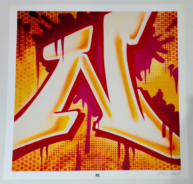
    6 HI3R0GLYPHS 2-Color Hand-Pulled Limited Edition Silkscreen Print on 250gsm Tan Fine Art Paper by Efdot Rare Street Art Famous Pop Artwork Artist. 2021 Signed & Numbered Limited Edition of 50 Artwork Size 9x12 6 HI3ROGLYPHS is an exploration of minimal landscapes and architecture. It is a continuation of Efdot's original 'HI3ROGLYPHS print and visual language. It's printed in a soothing neutral color palette on light grey paper. Screenprint Details: Edition of /50 signed and numbered by the artist 2 layer screen print on tan 250GSM paper Dimensions: 9 x 12 inches Certificate of Authenticity included Designed and printed in Brooklyn 2021.

    $159.00

Text Type Words & Sayings

The Significance of Text in Street Pop Art & Graffiti Artwork

Text-type words and sayings have been integral to street pop art and graffiti artwork since their inception. The use of text in these art forms is as varied as the artists themselves, ranging from tags and stylized signatures of the graffiti artist to larger pieces of textual art that may encompass sayings, quotes, or social commentary. These textual elements often serve as a direct line of communication between the artist and the public, conveying messages that can be personal, political, or simply aesthetic. Incorporating text into street art can transform urban landscapes into canvases that question, provoke, and engage. Words become a visual tool, as important as color and form in conveying the artist's message. In pop art, text has been used to comment on consumer culture and media, often incorporating slogans and logos from advertising and comic books. On the other hand, street art often uses text to convey more subversive messages, directly challenging viewers to rethink their surroundings and the status quo.

Evolution of Textual Use in Street Pop Art & Graffiti Artwork

Over the decades, the use of text in street pop art and graffiti artwork has evolved significantly. Initially, graffiti was about visibility and presence, with artists tagging their names to mark territory. However, as the art form matured, so did the messages conveyed through text. Artists began to use words to express their opinions on social and political issues, tell stories, and make their voices heard on topics often overlooked or ignored in mainstream discourse. The typography used in street pop art is as diverse as the messages themselves. Artists choose fonts that reflect the tone and content of their words – aggressive, whimsical, somber, or ironic. The lettering is not merely a method of communication but an artistic expression. It can be intricate, calligraphic, blocky, bold, distorted, and abstract. The style chosen by the artist adds another layer of meaning to the words depicted.

Cultural Impact and Social Commentary

Text in street pop art and graffiti artwork often reflects the culture and issues of the times. This has been evident in various movements and historical moments, where artists have used textual art to address inequality, racial injustice, environmental concerns, and political upheaval. The words painted on walls can be powerful reminders of societal challenges, often becoming iconic symbols of resistance and solidarity. Furthermore, textual street art can create a sense of community and shared experience. Slogans and sayings on public walls can resonate with passersby, fostering a collective identity or shared purpose. This aspect of street pop art and graffiti artwork highlights its role not just as a visual spectacle but as a social catalyst and a means of community building.

Contemporary Trends and Future Directions

The intersection between street art, pop art, and digital text is becoming increasingly prominent in the digital age. Artists are experimenting with new technologies to incorporate text into their works innovatively. This includes using projections, digital screens, and even augmented reality, which allows for a dynamic interaction between the text, the artwork, and the viewer. As street pop art and graffiti artwork continue to gain recognition in art, the use of text in these mediums is also being reevaluated and celebrated. Galleries and exhibitions now often feature works that originated on city walls, bringing the streets' powerful messages and textual artistry to a new audience.
In conclusion, text-type words and sayings in street pop art and graffiti artwork serve as a bridge between the artist and the public, offering a direct and impactful mode of expression. These textual elements not only enhance the visual impact of the artwork but also deepen its meaning and potential to inspire change. As street art and pop art evolve, the creative use of text remains a vital and dynamic aspect of these vibrant art forms, continuing to challenge, engage, and inspire.
Footer image

© 2026 Sprayed Paint Art Collection,

    • Amazon
    • American Express
    • Apple Pay
    • Bancontact
    • Diners Club
    • Discover
    • Google Pay
    • iDEAL Wero
    • Mastercard
    • PayPal
    • Shop Pay
    • Visa

    Login

    Forgot your password?

    Don't have an account yet?
    Create account