


Yellow
-

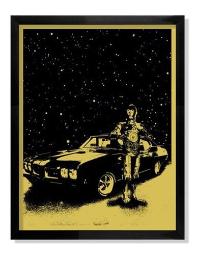
Lil Tuffy Threepio's GTO Silkscreen Print by Lil Tuffy
Threepio's GTO Artwork Silkscreen Limited Edition Print on 100 lbs. Metallic Star Dream Cover Stock Paper by Pop Culture Graffiti Artist Lil Tuffy. Lil Tuffy - "Threepio's GTO" 1 Color Screen Print Edition of 100 100 lbs. Metallic Star Dream Cover Stock 17.5" x 23"
$103.00
-

Choice Royce Be Cool Silkscreen Print by Choice Royce
Be Cool Silkscreen Print by Choice Royce Hand-Pulled on Cougar Fine Art Paper Limited Edition Screenprint Artwork. 2013 Signed Limited Edition of 35 Artwork Size 17.5x23.5 Silkscreen Print Be Cool Silkscreen Print by Choice Royce Be Cool is a bold and playful silkscreen print by Choice Royce, a piece that captures the expressive and dynamic energy of street pop art & graffiti artwork. Created in 2013, this hand-pulled screenprint on Cougar Fine Art Paper measures 17.5x23.5 inches and was produced as a signed limited edition of 35. The artwork features two cartoonish, exaggerated characters locked in an intense exchange, their emotions vividly conveyed through expressive facial features and stark color contrasts. This print embodies the raw, unfiltered visual language of contemporary street art, drawing inspiration from graffiti culture, pop art, and underground comics. Expressive Characters and Street Art Influence Choice Royce’s Be Cool presents a strikingly simple yet powerful composition, with two rounded, amorphous figures occupying the foreground against a solid gradient blue background. The character on the left, in yellow, appears slightly distressed, with raised eyebrows, clenched teeth, and a furrowed brow that spells out the letters "R U." The green character on the right, however, is far more animated, its wide-open mouth and exaggerated expressions indicating an aggressive or frustrated outburst. The juxtaposition of these two personalities creates a compelling visual dialogue, drawing the viewer into the tension of the scene. This kind of character-driven work is a hallmark of street pop art & graffiti artwork, where exaggerated expressions and simple yet bold designs convey emotion with immediacy. The use of heavy black outlines, flat colors, and minimal shading gives the artwork a raw, almost hand-drawn energy reminiscent of graffiti murals and sticker art found in urban environments. The influence of street culture, DIY aesthetics, and underground comics is evident in the simplicity of the design, which relies on minimal detail to maximize impact. Color, Form, and the Language of Urban Pop Art The color palette in Be Cool is both striking and deliberate, utilizing primary hues that create a sense of bold contrast and visual clarity. The bright yellow and green figures stand out sharply against the gradient blue background, a color choice that enhances the feeling of confrontation and energy in the scene. The smooth, rounded forms of the characters soften the intensity of their expressions, giving the piece a playful, almost cartoonish aesthetic that aligns with the themes of humor and exaggeration often found in street pop art & graffiti artwork. This use of bold, high-contrast color is a signature element in urban pop art, where simplicity in form is often balanced with striking visual impact. The lack of intricate details forces the viewer to focus on the emotional content of the characters, making the artwork an effective study in visual communication. The piece thrives on its ability to evoke human emotions through a minimalist yet expressive style, a technique frequently employed by street artists who use public spaces as their canvas. The Narrative and Cultural Relevance of Be Cool At its core, Be Cool is a commentary on human interaction, communication, and the push-and-pull dynamics of relationships. The expressions and body language of the characters suggest a moment of tension, possibly a disagreement or an emotional outburst, reflecting the kinds of everyday conflicts and exchanges that define modern life. The ambiguous context allows the viewer to interpret the scene based on personal experience, making it a relatable and engaging work of art. Choice Royce’s ability to distill emotion into such a minimal composition speaks to the power of street pop art & graffiti artwork as a storytelling medium. By stripping down the imagery to its most essential elements, the artist creates a universally understandable scene that transcends cultural and linguistic barriers. This direct, no-frills approach to art aligns with the raw energy of graffiti and urban expression, making Be Cool a perfect example of how street pop art can capture human emotions in a way that is both humorous and deeply resonant. This limited edition silkscreen print not only highlights the artist’s distinctive style but also serves as a testament to the lasting impact of expressive, character-driven street art. Be Cool stands as a vibrant, playful, and thought-provoking piece that captures the essence of contemporary urban visual culture, making it a valuable addition to any collection of street pop art & graffiti artwork.
$475.00
-

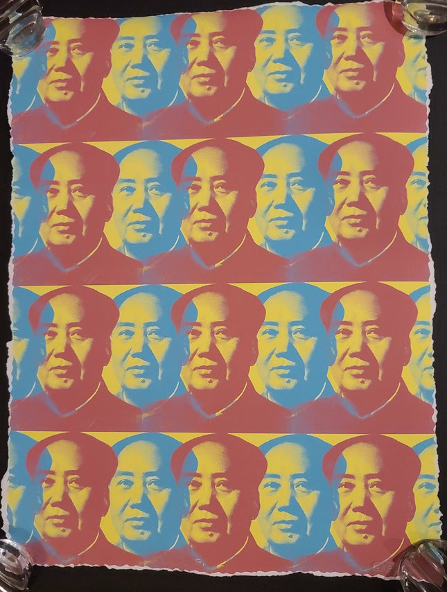
Aelhra Many Mao Green HPM Silkscreen Print by Aelhra
Many Mao Green HPM Limited Edition Hand Deckled 3-Color Hand-Pulled Silkscreen Print on Fine Art Paper by Aelhra Graffiti Street Artist Modern Pop Art. 2015 Signed & Numbered Limited Edition of 15 Artwork Size 18x24 #13/15 Hand Deckled Hand Painted Embleshed Multiple Print
$352.00
-

Pipsqueak Was Here!!! Check Original Collage Stencil Spray Painting by Pipsqueak Was Here!!!
Check Original Collage Stencil Spray Paint Painting by Pipsqueak Was Here!!! One of a Kind Artwork on Stretched Canvas by Street Art Pop Artist. 2021 Signed Mixed Media Spray Paint Stencil & Collage Painting Original Artwork Size 17.5x17.5 Check by Pipsqueak Was Here!!! – Stenciled Defiance and Found Texture in Street Pop Art & Graffiti Artwork Check is a 2021 original mixed media painting by the Dutch street art duo Pipsqueak Was Here!!!, created using stencil, spray paint, and collage on stretched canvas. Measuring 17.5 x 17.5 inches and signed by the artists, the piece is a striking example of layered urban narrative embedded in raw texture and symbolic juxtaposition. The central focus is a solemn, sharply rendered stencil portrait of a young girl, her gaze direct and almost confrontational. Surrounding her are collaged fragments of vintage advertisements, chemical warning labels, torn print ephemera, and bits of painted abstraction. The work fuses the language of caution, childhood, and consumer memory into a tightly composed field of urban poetics, emblematic of Pipsqueak Was Here!!!’s practice within Street Pop Art & Graffiti Artwork. Portraiture as Conscience and Confrontation The young girl at the center of Check is not passive. Her expression is serious, grounded, and quietly challenging. Rendered through crisp black and flesh-toned stencils, her presence stands in contrast to the chaotic noise of the background, giving the viewer a fixed point of emotional gravity. This figure, like many in the artists’ body of work, carries symbolic weight—youth positioned in a world already marked by danger and contradiction. Behind her, the image of a classic yellow cab ad and a “Miscellaneous Dangerous Goods” warning label creates a tense visual irony. The surrounding collage becomes more than aesthetic—it acts as commentary. Within the larger conversation of Street Pop Art & Graffiti Artwork, this portrait becomes a voice, one that challenges systems with quiet resolve rather than shouted slogans. Collage Construction and Found-Object Composition True to the aesthetic roots of street assemblage, Check incorporates found visual language through its collage layers. There is a fusion of urban memory and forgotten media: weathered typography, faded newspaper headlines, chemically coded symbols, and the layered build-up of spray and stencil. These textures mimic the walls of real cityscapes, where wheatpaste posters and public signage are constantly ripped, painted over, or tagged. The artists use these materials to form a narrative field, a conversation between safety and danger, visibility and erasure. This tactile collage method reinforces the connection between surface and story, ensuring that each component of the piece contributes not just visual interest, but historical resonance. It captures the energy of decay and renewal central to the ethos of Street Pop Art & Graffiti Artwork. Pipsqueak Was Here!!! and the Logic of Visual Protest With Check, Pipsqueak Was Here!!! continues to refine their unique balance of visual elegance and street-level urgency. The work radiates meaning through contrast—childhood innocence in the face of a world saturated with warnings and advertisements. The title itself implies confrontation, verification, or disruption. Every compositional choice speaks to power, placement, and perception. This painting is not just about form or beauty—it is a message embedded in image. As practitioners of Street Pop Art & Graffiti Artwork, the duo remains focused on environmental, social, and human vulnerability, making each artwork a kind of visual protest in the language of collage, spray, and symbol. Check is a potent reminder that art in public or private space has the ability to reveal truths, evoke empathy, and carry resistance through the everyday iconography of our shared environments.
$1,500.00
-

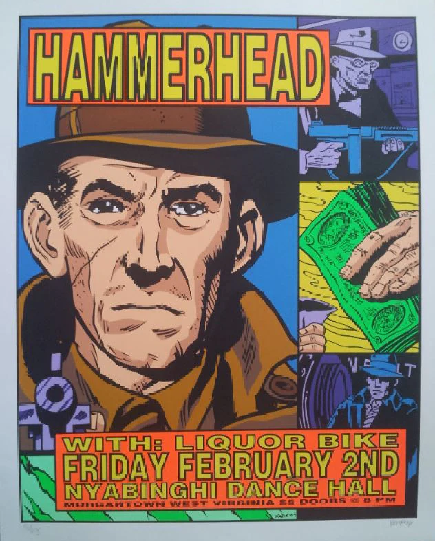
Frank Kozik Hammerhead Liquor Bike 1996 Nyabinghi West Virginia Silkscreen Print by Frank Kozik
Hammerhead Liquor Bike 1996 Nyabinghi West Virginia Silkscreen Print by Frank Kozik Hand-Pulled on Fine Art Paper Limited Edition Pop Street Art Artwork. 1996 Signed & Numbered Limited Edition of 675 Artwork Size 17.5x22.5 Silkscreen Print Music Gig Poster Art by Frank Kozik Nyabinghi Dance Hall, West Virginia February 2nd 1996
$230.00